Here is the final edited version of the Zippurs trailer that I've been working on all week:
Overall, I'm pretty satisfied with it. There were a couple of things that I really wanted to fit in (like the clip of the shoes dancing and the real zipper footage), but the timing did not work. Such is the dilemma of editing.
Second Item:
Here is the lit and textured "evolution" clip I animated. I also wanted to include more of this (for no other reason than all the pretty colors) but it would have been a) boring and b) less effective by the second. The brief glimpse of color from this shot is what makes it visually striking. Too much would have been overkill. Not to mention the lighting at the beginning and end was a little off. My original idea was to have the shoe spin progressively faster and transform into an "r" so the word would read "revolution." Time, however, did not allow.
Tuesday
Sunday
Sketch and 2 Blogs (November 30-December 6)
There is a poem titled "Fog" by Carl Sandburg that says "The fog comes in on little cat feet." For this sketch, I imagined substituting 'fire' for 'fog.'

First Item:
Here are the first 100 frames of an animated shoe (in progress) that I've been working on:
Second Item:
This was my attempt at an "ipod" shoe shot for the trailer/commercial (basically just a shoe silhouette.)
Tuesday
Weekly Blog (November 23-29)
Another commercial technique that I found effective was to sell a concept as opposed to a product. For example, in this Reebok commercial, Reebok is selling the idea of going outside and being active (not being a couch potato). That gives their product a greater meaning and a depth that attracts customers, as if to say "It's not a shoe. It's a way of life."
Weekly Blog and Sketch (November 23-29)
I've been looking at some of the more popular commercials online. I've noticed a pattern- the most effective ones (the advertisements that not only sell their product but create an impression and become memorable) are the ones that have a storyline. Punchlines seem to help as well. This one is an example of a commercial with a story. The audience listens, judges, and relates to the characters (the man and his 'wife'). This emotional connection is key. As is the twist at the end, which transforms the commercial from a simple advertisement to an anecdote which may be brought up in conversation later. Thus the ad continues to run even after it has aired.
Sketch:

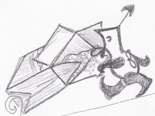
This bird-snake-alien-vulture thing started out as a scribble.
Sketch:

Friday
Weekly Blog (November 16-22)
Lately, I have been trying to pay attention to the composition and editing of advertisements. This is not a commercial, but it is impressive-- The author draws from an incredible number of sources yet maintains fluidity and leaves the dignity of the story's tempo intact.
Wednesday
Weekly Blog (November 16-22) and Sketch
This advertisement has been all over the internet. Youtubers continue to parody it (in a good way), substituting their favorite characters for the dancers. It has crossed the language barrier and become popular to internet-users across the world. What makes it so effective? Why this commercial? Personally, I believe it has to do with the music. As we saw in our animation assignment, music enriches a video immensely. The smooth flow from dancer to dancer is also intriguing to watch. Basically: great transitions and catchy music.
Speaking of music, here is a random sketch of mine depicting an animal-instrument creation. (Kangaroo and string instrument?)

Weekly Blog (November 16-22)
Now that we are starting to apply our skills toward the creation of a marketable product, I thought it would be helpful to investigate the business aspect of the field. This site lists 10 tips for effective advertising campaign. These stood out to me:
- target audience (pre-teens to young adults in our case)
- highlight your competitive advantages (reconfigurable design, allows user creativity)
- don't try to be everything to everyone (Sounds simple, but avid designers are likely to have this problem. You want your product to have the widest appeal and the largest audience. Instead, the product ends up being too vague and lacking identity. We luckily had a specific idea to begin with and did not have to grapple with this issue)
- test your ads (Reactions to test screenings of commercials and media advertisements was something we considered incorporating into our final presentation)
- monitor you ads (Not just your ads but your image. The anonymity of the internet allows consumers to freely express their opinions and praise or condemn your company, as well as alter your media to fit their impression of you. Being aware of the world's perception of your company tells you how effective your products and advertisements are.)
Friday
Animation Assignment
I was heavily influenced by Piet Mondrian. For me, his bold colors and partitioned planes are reminiscent of information and technology:

This animation is roughly 600 frames. I animated the box using 200 and sphere using 400. Originally, I had hoped for the animated objects to be moving simultaneously, but it was much simpler to approach them separately and edit the result with iMovie.
Sunday
2 Weekly Blogs (November 9 - 15) and Sketch
Sketch:
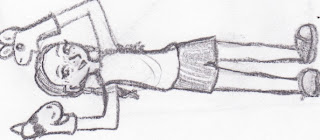
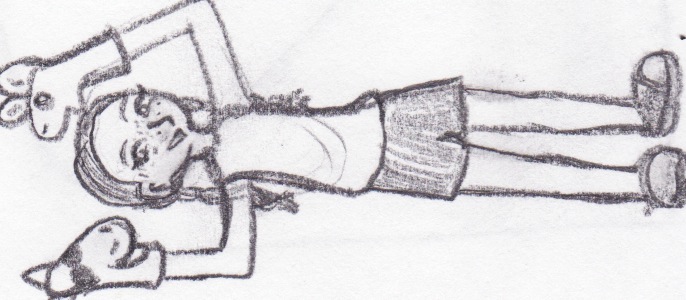
This sketch was born of a random scribble, which explains the random concept. I believe it is a zebra-snake-butterfly cross that delivers mail and wears a strange hat.

I found this website on three point lighting pretty helpful in explaining how certain dimensions and attributes affect a light (and thus the subject).
Item Two:
These links are to short Pixar animations. The first one tells a little more about Dug the dog, from Up!, and the second one, titled Partly Cloudy, was the short preceeding Up!. Both of these are remarkable for their range of emotion, anmiation quality, and storytelling.
http://www.youtube.com/watch?v=StIA3MsrUGk
http://www.youtube.com/watch?v=Am1yiTUy-pc


Friday
Weekly Blog (November 2-8) and Sketch
Although not as flashy as some of the other animations I've seen, this one is impressive in its storytelling and characterization. It builds a lifetime in two minutes.
My sketch for the week- a creature cross:

Weekly Blog (November 2-8)
What I find most fascinating about this video is the explanation it gives after the actual 'film.' I thought only the monster was animated but was surprised to find how much of the background was digitally rendered.
Wednesday
Weekly Blog and Sketch (October 26-November 1)
Similar to the Transformer website Professor Castillo showed us in class, this website advertises a book series by Kenneth Oppel but uses interactive and creative methods to do so. The navigation on the first page is similar to the control of an airship (theme of the books), and each book's page presents information on the novel in a different way, such as interactive magazine or newspaper articles.
Sketch:

Sketch:

Here are some brainstorming sketches for the lighting assignment. I think I'm going to use the one in the bottom right corner (reminiscent of a jester/jack-in-the-box).
Weekly Blog (October 26-Novembr 1)
Now that we're getting into animation, I thought I'd post an example of what we might aim for. I love the very opening shot. The lighting and natural setting is beautiful and very aesthetically pleasing.
Sunday
2 Weekly Blogs and Sketch (OCT 19- OCT 25)

Item One:
The seamless collaboration between animation, sound, and text makes this one of my favorite animations of all time. I only wish I knew what they were saying...
Item Two:

I love this abstract painting (from here) because, while it IS abstract, you have to look at it for a while to realize that is a crossbreed between images you are familiar with and shapes meant to stir the imagination.
Tuesday
2 Weekly Blogs and Sketch (OCT 12-18)
Item One: The fireside lighting in some of these screenshots from The Sims is pretty inspiring. Not only do they achieve this effect in a still frame but they have programmed it to respond to a virtual world in real time. The animation adds a whole other level to it. How would you go about creating similar lighting?
Item Two: I'm not sure about the fireside glow, but here's an interesting tutorial on making a light saber glow. I'm using similar principles in my lighting assignment: Check it out.
Sketch: I wanted to do something with halves of mismatched shapes but ended up putting faces on them.

Item Two: I'm not sure about the fireside glow, but here's an interesting tutorial on making a light saber glow. I'm using similar principles in my lighting assignment: Check it out.
Sketch: I wanted to do something with halves of mismatched shapes but ended up putting faces on them.

Saturday
2 Weekly Blogs (OCT 5-OCT 11) and Sketch
Item One:
I created this pawn in 3Ds Max:

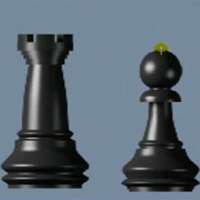
I created this pawn in 3Ds Max:

Items 2, 3, 4, etc.:
Here are a few of the resources I used:
Here are a few of the resources I used:
(I used the above picture for tracing)
I found some general information on types of lighting here, and I also glanced through several tutorials from this site.
Sketch: A wind-up toy that has just escaped the cereal box it came from...
Sketch: A wind-up toy that has just escaped the cereal box it came from...

Sunday

Weekly Blog and Sketch (SEP 28- OCT 4)
Item One:
http://www.3dsmaxtutorials.net/
http://www.3dsmaxtutorials.net/
This seems like a good place to start with 3d studio max. There are several simple tutorials for beginners (though I haven't had the chance to try one yet).
Sketch: Inspired by real life torture, I present to you... the Chair of Vista! The screen prompts you with the option to quit torture, but every time "ok" is clicked, the OS crashes and you have to wait for the machine to restart. Meanwhile, the seat of the chair is being slowly lowered. The lower back of the chair prevents the victim from slouching, but they eventually have to rest against the spikes and hold themselves up (as the seat lowers) to prevent asphyxiation. Yep, I just loooove Vista.

Friday


Sunday
2 Weekly Blogs and Sketch (SEP 21- SEP 27)
Item One: A friend of mine told me about this website. Miranda July is an artist who deals with both performance art and digital art. Her work is unusual and thought-provoking... mirandajuly.com
Item Two: Staircase Tutorial
We found this during the lab on Friday. Afterwards, I went through the tutorial and discovered a few things. To use the rotation tool the way he does, you have to pay attention to the angle in the lower right text box. Also, to get the '+' on the rotation and move tools, press the option key.
Sketch:

2 Weekly Blogs and Sketch (SEP 14-SEP 20)
Item One:
This is a compilation of special effects throughout the years, ranging from early 1900's to present day. The art has improved tremendously, and it seems there is very little we can do to better it...but that's probably what they thought back in 1933 when King Kong first came out.
Item Two:
The following link is just one page from an example of interactive digital media. The entire site (nobodyhere.com) is an interactive media maze with no apparent purpose. I find it inspiring because the creator uses interactive media in such random and abstract ways to illustrate his thoughts.
http://nobodyhere.com/justme/cards.here
Sketch: Sock puppets! For some reason, it keeps showing up sideways... oh well.
Sketch: Sock puppets! For some reason, it keeps showing up sideways... oh well.
Monday

Sunday
Weekly Blog (SEP 7-SEP 13)
Cute website, but I chose it for the interactive digital media and the purpose toward which it works. Children think they're watching some form of television when, in reality, they are being tricked into reading! [insert sinister laugh here]
Weekly Blog (SEP 7-SEP 13 )
As we move forward into digital media, we will undoubtedly have to move back, drawing from the past. Perhaps literally. The following is a website of Egyptian art examples.
http://www.egyptartsite.com/
Under 'Design,' check out the 'motif' section. In particular, the Scarab and Cow patterns caught my eye.
Saturday


Wednesday
Haptic Models
As far as personal preference goes, I like close shots best. They offer greater mystery and abstraction...
 This was an egg carton with plastic silverware mounted on an ice cream lid. Behold, a tunnel.
 The lighting (or lack thereof) is what caused me to choose this one. The sepia tones remind me of older media, as if the model is from another era.
 Again, lighting was a key element in my choice. The contrast between the illuminated model and the darker background helps to give the piece depth.
  The visible texture amazed me. This one is almost reminiscent of a landscape photo.
 Silhouette. Classic. Enough said.

I seem to be very sensitive to lighting. I chose this for the shadows and focus of light.
 This was an egg carton with plastic silverware mounted on an ice cream lid. Behold, a tunnel.
 The lighting (or lack thereof) is what caused me to choose this one. The sepia tones remind me of older media, as if the model is from another era. Again, lighting was a key element in my choice. The contrast between the illuminated model and the darker background helps to give the piece depth.
  The visible texture amazed me. This one is almost reminiscent of a landscape photo.
 Silhouette. Classic. Enough said.
I seem to be very sensitive to lighting. I chose this for the shadows and focus of light.
Sunday
Weekly Blog (AUG 31-SEP 6)

At first, I assumed this was a photograph. No, it is actually a virtually rendered 3D model. The program that deviantartist "zipper" used to create it was not noted, but the attention to detail is breathtaking. The reflection of the second hand, the textures, the delicate lighting of every element-- If you look closely enough, you can see faint scratches around the edges of the glass from opening and closing the watch.
Weekly Blog (AUG 31-SEP 6)
"The Mysterious Explorations of Jasper Morello" is a short animation that won several awards and was nominated for an Oscar in 2006. It primarily uses silhouettes to tell the story. 2D and 3D images are combined, rendering a unique (and perhaps new?) effect. The colors are limited to dark sepia tones, reminiscent of older films. I find this particularly refreshing because it explores new territory in animation while simultaneously drawing from the simplicity of the past.
Weekly Blog (AUG 31-SEP 6)
 The idea for this sketch was born in my Computer Logic Design Lab, where (after hours of staring at truth tables and k-maps) I noticed the equations had an abstractly artistic quality... as well as a monstrously confusing one. Thus, the Schematic Monster tore its way into existence. Similar to the musicians in the techno documentary from class, this sketch searches for art where most do not bother to look.
Weekly Blog (AUG 24-30)

Weekly Blog (AUG 24-30)
This animation, called "Replay," uses a lot of close ups before (literally) showing the larger picture. It forces the audience to make conjectures, which I thought was a good way to capture attention. No one likes to be spoon fed. I don't expect to do anything like this anytime soon... but it's definitely something to aim for.
Weekly Blog (AUG 24-30)

This photo manipulation, titled "Victory" and created by deviantart user Eisblume, caught my attention because not only is it visually stimulating (what gorgeous coloring!) but creative in conveying an underlying concept-- Imagine a day when Nature sheds the harness forced upon her by mankind. The tables turn. It provides food for thought... and that's inspiring.
Source:http://eisblume.deviantart.com/art/Victory-71581807
Assignment I-- Part II


***

***Top hat and pocket watch borrowed from http://www.wakefield.gov.uk/NR/rdonlyres/B132527A-C7A1-4D64-8A47-C193E6FCABFF/0/TopHatAround1905.jpg and http://watchandmarvel.com/wp-content/uploads/2008/04/breguet-grand-complication-ref.-1160-pocket-watch2.jpg respectively.
Wednesday


Subscribe to:
Comments (Atom)